
Designing for Emotional Trust and Scale
Designing for Emotional Trust and Scale
Redesigning Soulstice’s Webapp to Drive Retention and Operational Efficiency
Redesigning Soulstice’s Webapp to Drive Retention and Operational Efficiency
Impact
Impact
42% Reduction in CX Queries
Increased User Profile Completion
35% Reduced Design-to-Dev Shipping time
42% Reduction in CX Queries
Increased User Profile Completion
35% Reduced Design-to-Dev Shipping time
My Role
My Role
Lead Product Designer
Lead Product Designer
Timeline
Timeline
3 months (2-week sprints)
3 months (2-week sprints)
Team
Team
1 design intern (mentee), PM, 2 CX reps, 3 engineers
1 design intern (mentee), PM, 2 CX reps, 3 engineers
Platform
Platform
Responsive web
Responsive web
Tools
Tools
Figma, Figjam, Sketch, Storybook
Figma, Figjam, Sketch, Storybook
CONTEXT
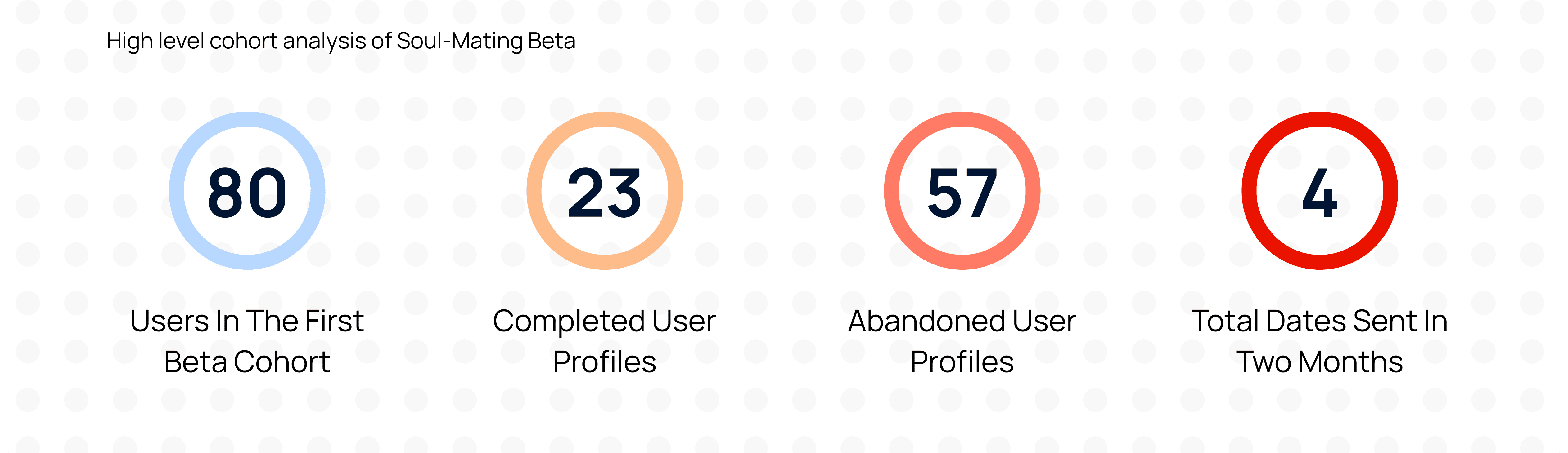
Soul-Mating is Soulstice's relationship-focused dating platform designed for adults aged 31–60. The product promises curated blind-dates with vetted matches and deeply personal journeys. As the platform transitioned out of its early beta phase, the webapp failed to meet usability, scale, and trust expectations. The first launch of the beta webapp was live for 2 months when I joined the team and the first cohort had 80+ early sign ups.
I led the redesign of the post log-in user experience to improve retention, reduce CX effort, and create infrastructure for product expansion.
Soul-Mating is Soulstice's relationship-focused dating platform designed for adults aged 31–60. The product promises curated blind-dates with vetted matches and deeply personal journeys. As the platform transitioned out of its early beta phase, the webapp failed to meet usability, scale, and trust expectations. The first launch of the beta webapp was live for 2 months when I joined the team and the first cohort had 80+ early sign ups.
I led the redesign of the post log-in user experience to improve retention, reduce CX effort, and create infrastructure for product expansion.
PROBLEM STATEMENT
What Was Broken
What Was Broken
The UX was clunky and unscalable - the logistics were communicated manually, key user actions like profile completion were slow and needed a lot of push from CX.
Users didn't feel guided or reassured in a vulnerable process of blind dates and matchmaking, resulting in high task abandonment in key flows.
Information architecture was fractured and didn't support the product roadmap established by the leadership.
The UX was clunky and unscalable - the logistics were communicated manually, key user actions like profile completion were slow and needed a lot of push from CX.
Users didn't feel guided or reassured in a vulnerable process of blind dates and matchmaking, resulting in high task abandonment in key flows.
Information architecture was fractured and didn't support the product roadmap established by the leadership.
Business Goals
Business Goals
Improve post-login retention and engagement.
Reduce manual workload for the CX team.
Build a scalable foundation for future roadmap features.
Improve post-login retention and engagement.
Reduce manual workload for the CX team.
Build a scalable foundation for future roadmap features.

MY ROLE
I inherited an already-live webapp with fragile architecture and a lean team. Within a short timeline and dev bandwidth constraints, I focused on meaningful interventions rather than full rebuilds. I:
I inherited an already-live webapp with fragile architecture and a lean team. Within a short timeline and dev bandwidth constraints, I focused on meaningful interventions rather than full rebuilds. I:
Led UX strategy and design execution.
Reworked the information architecture, improved usability of key flows like profile completions.
Introduced key features like "Date Night" to maintain a sync in logistics between the user and the CX team, offers from partner vendors as well as tracking relationship journeys.
Built a design library for consistency and speeding up future growth.
Mentored a junior designer.
Bridged design decisions across PM, CX, and dev.
Led UX strategy and design execution.
Reworked the information architecture, improved usability of key flows like profile completions.
Introduced key features like "Date Night" to maintain a sync in logistics between the user and the CX team, offers from partner vendors as well as tracking relationship journeys.
Built a design library for consistency and speeding up future growth.
Mentored a junior designer.
Bridged design decisions across PM, CX, and dev.
HOW MIGHT WE
"Build user trust and excitement around blind dating through a solution that seamlessly supports our unique product-service model?"
"Build user trust and excitement around blind dating through a solution that seamlessly supports our unique product-service model?"
SOLUTION
I designed the web and mobile apps for Soul-Mating with a more defined visual language, streamlined user flows and some new key features that supported the mission and offerings of Soulstice. Soul-Mating solves the main challenges of the current dating landscape through —
I designed the web and mobile apps for Soul-Mating with a more defined visual language, streamlined user flows and some new key features that supported the mission and offerings of Soulstice. Soul-Mating solves the main challenges of the current dating landscape through —
A scalable user dashboard with quick action buttons for updates from CX, venues and marketing.


An exciting date-night feature where users can manage logistics and prepare for their curated blind date.


Improved usability, feedback and consistency around crucial user flows like updating calendar and completing profile.


DISCOVERY AND RESEARCH
I took a mixed-methods approach to deeply understand friction points:
I took a mixed-methods approach to deeply understand friction points:
Reviewed Clarity analytics (abandonment, dead clicks, session recordings)
Conducted internal interviews with the CX team to map the top recurring complaints
Created a "typical user" profile for our target users by mapping out their demographics, psychographics, needs and pain points.
Reviewed Clarity analytics (abandonment, dead clicks, session recordings)
Conducted internal interviews with the CX team to map the top recurring complaints
Created a "typical user" profile for our target users by mapping out their demographics, psychographics, needs and pain points.
KEY FINDINGS
Metrics on MS Clarity
Metrics on MS Clarity
Although the overall target users for all of Soulstice is wide, Soul-Mating in particular focused on the following user profiles.
Although the overall target users for all of Soulstice is wide, Soul-Mating in particular focused on the following user profiles.

CX Interviews and Pain Points
CX Interviews and Pain Points
Although the overall target users for all of Soulstice is wide, Soul-Mating in particular focused on the following user profiles.
Although the overall target users for all of Soulstice is wide, Soul-Mating in particular focused on the following user profiles.


Soulstice Users
Soulstice Users
Although the overall target users for all of Soulstice is wide, Soul-Mating in particular focused on the following user profiles.
Although the overall target users for all of Soulstice is wide, Soul-Mating in particular focused on the following user profiles.

User and Process Flow
User and Process Flow

DESIGN AND STRATEGY
Pairing the above inferences with business goals and some of the bottlenecks I saw internally among XFN teams, I built my priorities with the PM -
Pairing the above inferences with business goals and some of the bottlenecks I saw internally among XFN teams, I built my priorities with the PM -
Map out the user journeys, key user flows and fix gaps in those flows
Improve usability on key user tasks to reduce task abandonment rate
Build user trust, excitement and anticipation on dates while reducing CX efforts
Increase points of engagement within the webapp
Create a design library and internal hand-off pipelines and documents to reduce lossy design to dev transition and design debt
Map out the user journeys, key user flows and fix gaps in those flows
Improve usability on key user tasks to reduce task abandonment rate
Build user trust, excitement and anticipation on dates while reducing CX efforts
Increase points of engagement within the webapp
Create a design library and internal hand-off pipelines and documents to reduce lossy design to dev transition and design debt
Stakeholder Considerations
Stakeholder Considerations
The main stakeholders for my design were - the end users, the CX team, the marketing team and the engineering team. The resulting designs needed to solve the needs of all the teams directly involved while providing a user-first experience.
The main stakeholders for my design were - the end users, the CX team, the marketing team and the engineering team. The resulting designs needed to solve the needs of all the teams directly involved while providing a user-first experience.

DESIGN SOLUTIONS
I spent the next 4 sprints working on rebuilding the webapp for desktop and mobile.
The design improvements I made were:
I spent the next 4 sprints working on rebuilding the webapp for desktop and mobile.
The design improvements I made were:
Improved Information Architecture
Improved Information Architecture

Current Soul-Mating Beta Webapp - broken flows, poor information organization, soul-less :(
Current Soul-Mating Beta Webapp - broken flows, poor information organization, soul-less :(

New Information Architecture
New Information Architecture
Why this worked?
Why this worked?
Identified and patched up broken links and flows
Easy access to key user actions
Logical segmentation of categories
Identified and patched up broken links and flows
Easy access to key user actions
Logical segmentation of categories
Validation
Validation
An evaluative usability testing with 6 users on 8 key flows showed:
A reduction in task completion time
Reduced number of clicks per task
Guided and Progressive User Profile Completion

Why this worked?
Including a guided user profile completion flow allowed the users to complete their profile in one go before accessing the rest of the webapp as opposed to letting them figure out what was missing and how to complete it
Validation
Follow up with CX after 4 weeks confirmed -
Reduced CX effort in nudging new users to complete profiles
Required number of follow ups went down by an average of 75% per user
Follow up with CX after 4 weeks confirmed -
Reduced CX effort in nudging new users to complete profiles
Required number of follow ups went down by an average of 75% per user
Calendar Usability
Calendar Usability
Keeping user calendar up to date was mandatory for us to plan out a blind date for them. The users had to come in every month to update this and we needed to make sure it was easy to do so.
Keeping user calendar up to date was mandatory for us to plan out a blind date for them. The users had to come in every month to update this and we needed to make sure it was easy to do so.
ITERATION 1
I envisioned a dynamic calendar that recorded the timeslots entered by users, allowed the option of bulk selecting through the "repeats weekly" button, drawing inspiration from how we create recurring meetings through all our meeting scheduling apps and a panel on the side through with users could view and edit slots at once. I quickly learned that this was too many things and once and proved confusing.
I envisioned a dynamic calendar that recorded the timeslots entered by users, allowed the option of bulk selecting through the "repeats weekly" button, drawing inspiration from how we create recurring meetings through all our meeting scheduling apps and a panel on the side through with users could view and edit slots at once. I quickly learned that this was too many things and once and proved confusing.

Why this didn't work
Why this didn't work
Information overload on the screen
Feedback was too subtle
Interactions didn't feel as familiar to the users as I thought it was going to be
Information overload on the screen
Feedback was too subtle
Interactions didn't feel as familiar to the users as I thought it was going to be
Validation
Validation
I did an internal user testing with non-tech members of the company to see how they would interact, showing signs of struggle, "clicking around" to figure it out
I did an internal user testing with non-tech members of the company to see how they would interact, showing signs of struggle, "clicking around" to figure it out
ITERATION 2
In the next iteration, I worked on progressively revealing information, more visible feedback and visual cues and improved verbiage that made the interactions clearer.
In the next iteration, I worked on progressively revealing information, more visible feedback and visual cues and improved verbiage that made the interactions clearer.

Why this worked
Why this worked
Bulk selection
Quick actions
Familiar interactions
Focused information
Bulk selection
Quick actions
Familiar interactions
Focused information
Validation
Validation
Evaluative usability testing with 6 users showed:
An increase in task completion rate in the first attempt
A verbal sigh of relief from the users when they saw this fixed
Evaluative usability testing with 6 users showed:
An increase in task completion rate in the first attempt
A verbal sigh of relief from the users when they saw this fixed
Date Night

How date nights were previously indicated.
How date nights were previously indicated.

Updated Date Night as a stand alone feature
Updated Date Night as a stand alone feature

Confirming and accessing date on mobile
Confirming and accessing date on mobile
Why this worked?
Why this worked?
Relationship Tracking - see when a date is scheduled, unscheduled, who the user is currently dating
Relationship Tracking - see when a date is scheduled, unscheduled, who the user is currently dating
Logistics - View all date related logistics and guidelines in one place - helped in shifting from manual CX communication to interface based communication, and worked to lay down guidelines to standardize all the venue information in the system
Logistics - View all date related logistics and guidelines in one place - helped in shifting from manual CX communication to interface based communication, and worked to lay down guidelines to standardize all the venue information in the system
Quick actions - Users could Request to Reschedule, Confirm or Cancel and reach customer support for any queries at the click of a button
Quick actions - Users could Request to Reschedule, Confirm or Cancel and reach customer support for any queries at the click of a button
Third Part Partnerships - Soulstice users could take advantage of our third-party partnerships and offers prior to the date like booking an Uber, checking in on B-Safe and other future connections we may make at this place
Third Part Partnerships - Soulstice users could take advantage of our third-party partnerships and offers prior to the date like booking an Uber, checking in on B-Safe and other future connections we may make at this place
Improving Engagement on User Dashboard
Improving Engagement on User Dashboard

Updated User Dashboard as a scalable space for features, promotions and content
Updated User Dashboard as a scalable space for features, promotions and content
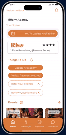
Dashboard on mobile
Dashboard on mobile

Updated dashboard when a date is assigned
Updated dashboard when a date is assigned
Why this worked?
Why this worked?
Bite sized information
Links to all things Soulstice, events, marketing promotions and content
Bite sized information
Links to all things Soulstice, events, marketing promotions and content
Validation
Validation
Longer user sessions
Increase in repeat log ins
Longer user sessions
Increase in repeat log ins
Design Library Creation and Maintenance
Design Library Creation and Maintenance
Alongside diagnosing the key issues with the webapp, I realized that another major internal problem we were dealing with is lossy and time taking design to dev hand off due to a lack of a common design language and handoff documents. During these three months, I also created and documented a small scale design system on Figma and shared with dev via Storybook.
Alongside diagnosing the key issues with the webapp, I realized that another major internal problem we were dealing with is lossy and time taking design to dev hand off due to a lack of a common design language and handoff documents. During these three months, I also created and documented a small scale design system on Figma and shared with dev via Storybook.

SUCCESS METRICS AND IMPACT

TRADEOFFS, PITFALLS AND PRIORITIES
There were several small and big decision points to be made throughout the course of these three months - some because of time constraints, business priorities, complex internal systems and some due to dev constraints.
For instance -
Strong constraints from dev team to work with existing UI components and brand guidelines to limit the amount of re-work
Background service mapping was still essentially manual - leading to complex edge cases and possibilities - for example, cancelling date was not possible within 24hrs of the date, Uber was to be booked 48hrs before the date, no shows meant a loss of money for that pre-paid date - a lot of guidelines and feedback for the user, a lot of fine print that needed to be presented in a non overwhelming way
Focus was solely on post log-in experience although the initial onboarding experience and conversion metrics needed a strong boost as well
There were several small and big decision points to be made throughout the course of these three months - some because of time constraints, business priorities, complex internal systems and some due to dev constraints.
For instance -
Strong constraints from dev team to work with existing UI components and brand guidelines to limit the amount of re-work
Background service mapping was still essentially manual - leading to complex edge cases and possibilities - for example, cancelling date was not possible within 24hrs of the date, Uber was to be booked 48hrs before the date, no shows meant a loss of money for that pre-paid date - a lot of guidelines and feedback for the user, a lot of fine print that needed to be presented in a non overwhelming way
Focus was solely on post log-in experience although the initial onboarding experience and conversion metrics needed a strong boost as well
KEY LEARNINGS
It all starts with the customers - they might not always be able to tell you explicitly what works or what doesn't, but there are indicators everywhere, if you know where to look.
Owning an entire redesign isn't simply about the UI or usability even, it is important to go out of your way to get to the crux of the problem and making sure your solutions help all the stakeholders involved in the process even if it means taking on roles you didn't see yourself doing.
Constraints breed resourcefulness - working with a small team and striving to ship fast, within the constraints of dev bandwidth, forced me to cut the noise, prioritize, and deliver work that is scalable and reusable.
Thorough documentation although maybe hard to introduce at scale and adopt within an organization, it makes all the difference in team operation efficiency.
It all starts with the customers - they might not always be able to tell you explicitly what works or what doesn't, but there are indicators everywhere, if you know where to look.
Owning an entire redesign isn't simply about the UI or usability even, it is important to go out of your way to get to the crux of the problem and making sure your solutions help all the stakeholders involved in the process even if it means taking on roles you didn't see yourself doing.
Constraints breed resourcefulness - working with a small team and striving to ship fast, within the constraints of dev bandwidth, forced me to cut the noise, prioritize, and deliver work that is scalable and reusable.
Thorough documentation although maybe hard to introduce at scale and adopt within an organization, it makes all the difference in team operation efficiency.
Looking for a design upgrade? Let's chat!
Drop by to say hi!
2026 Designed by Pratya Nellore on Framer
Looking for a design upgrade? Let's chat!
Drop by to say hi!
2026 Designed by Pratya Nellore on Framer